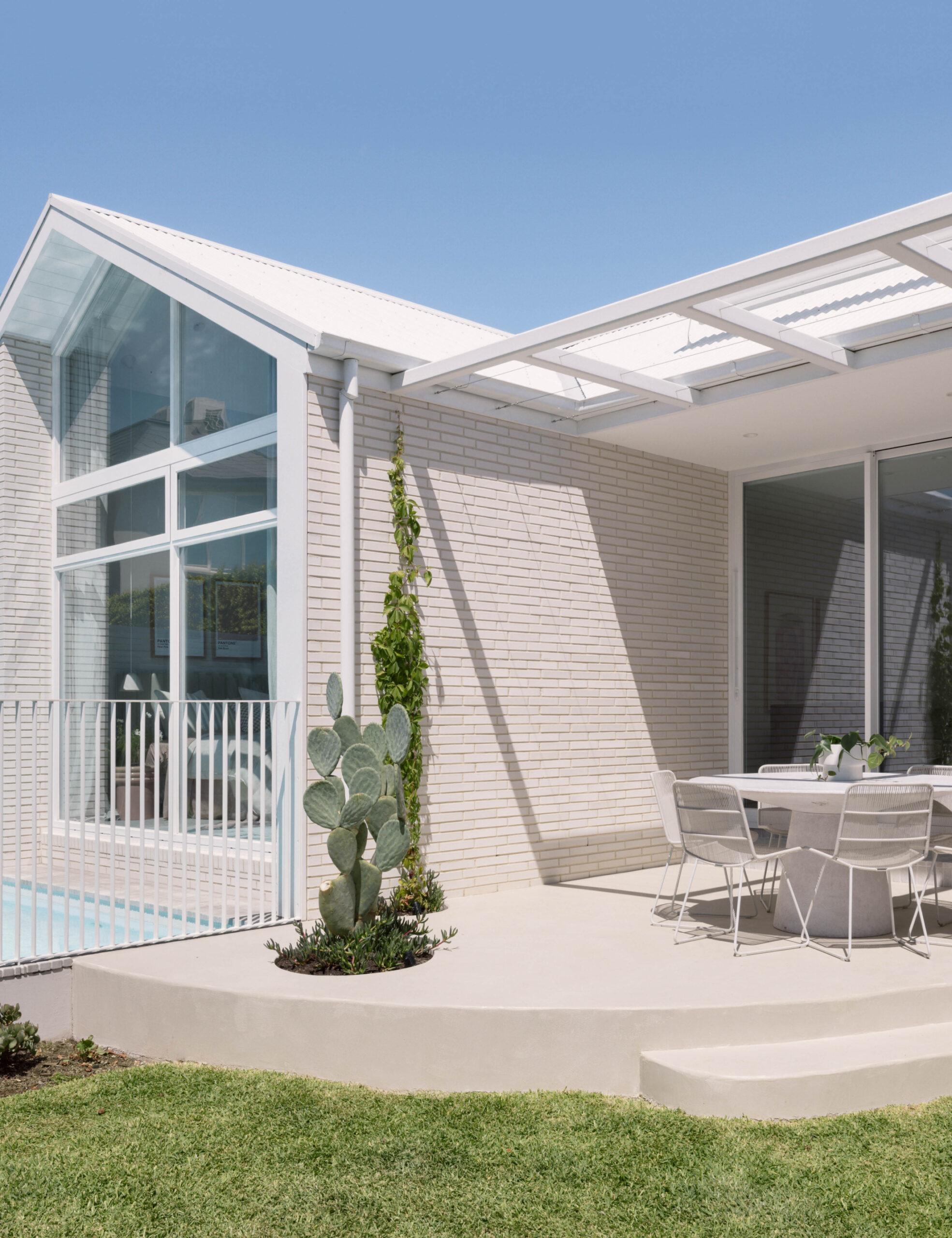
Norsu is a part retail, part interior design, business co-owned by Natalie Wheeler whose design talents are on full display in her family home.
Clients and customers may already be familiar with the house, which Natalie and her husband bought in 2017 and slowly renovated in two major stages.
Natalie documented the entire renovation process online, inviting others into the project to be inspired, and learn from her mistakes along the way!
The first stage of the renovation — completed over five months before moving in — stuck to the home’s existing footprint inclusive of an ‘unfortunate’ 1980s flat roof addition.
‘We gave it a quick reno makeover using a few cost-effective hacks to make it more family-friendly and versatile… But we always knew it was just phase one,’ says Natalie.
‘Fast forward a few years, and with the kiddos growing up (and the one bathroom for all dramas hitting their peak!), we knew it was time for round two.’
This second stage of the renovation saw the original facade and rooms retained and repurposed (‘Why mess with something so perfectly imperfect,’ Natalie says), but the simplistic ‘80s addition needed to go.
‘The kitchen was small, and the low ceilings in the flat roof extension didn’t exactly scream “airy and spacious.” Not to mention the lack of insulation,’ says Natalie.
Natalie worked with Herbert & Howes to design the new addition featuring soaring ceilings and pastel colours inspired by the Sorrento Beach House by Pandolfini.
The floor plan is loosely divided into three, stepped tiers: the original bedrooms, the main living areas, and the ‘kids zone’ at the rear.
Natalie explains why, ‘There was a flood overlay we found out about a little late in the game, and it definitely caused a ripple effect on our extension plans.’
‘Initially, the only step-up in the house was supposed to be from the hallway to the living and kitchen zones, but this overlay meant we had to add steps up to the kids’ zone as well…
‘But honestly, in the end, the home is divided into these three distinct zones, and I’ve really grown to love how it all turned out. What started as a challenge has now become one of my favourite parts of the house.’
Natalie describes her home now as a ‘living, breathing extension of the Norsu aesthetic.’
She adds, ‘It reflects everything we adore and share with our clients through the norsuDesign arm of the business. ‘From the interiors to the styling, we’ve poured the same love and attention into our home as we do for our clients every day.
‘It’s basically like walking into a Norsu showroom, but one that we call home!’

