Thirteen years ago, architecture power couple Zuzana Kovar and Nicholas Skepper took their first step on the property ladder — purchasing a run-down Queenslander worker’s cottage in Red Hill, Brisbane.
Due to its poor condition, they scored a great deal on the double-storey pad, originally built in the early 1900s. With a dream of starting their own architecture studio — Nicholas is a registered architect, while Zuzana is an architecture graduate and university lecturer — they sought to revive the dilapidated house to make it both their office and residential home.
Two years later, the couple opened their eponymous firm Zuzana & Nicholas. And now, over ten years and two kids later, their labour of love is finally complete.
‘The coupling of our house and studio on the same site allows us flexibility in managing work and life with young kids in a way that would be much more difficult to manage if the studio were located elsewhere,’ Nicholas explains. ‘We have a very fluid boundary between work and life, which for the most part is positive — we love what we do.’
But it was certainly no easy feat. The pair lived at the house from day dot while slowly renovating and transforming it, without making any changes to the structural footprint. The first step was relocating the upstairs kitchen, living and dining areas to the north side of the original cottage to capture the most of the natural light and views of the garden.
On the other side, the bedrooms were shifted to the darker and more inward-facing southern edge of the house. Taking cues from the timber detailing of typical Queenslander architecture, and also drawing inspiration from the use of timber in traditional and contemporary Japanese architecture (see Atelier Bow-Wow’s ‘House Asama’), the home soon developed a playful dichotomy between its varying styles.
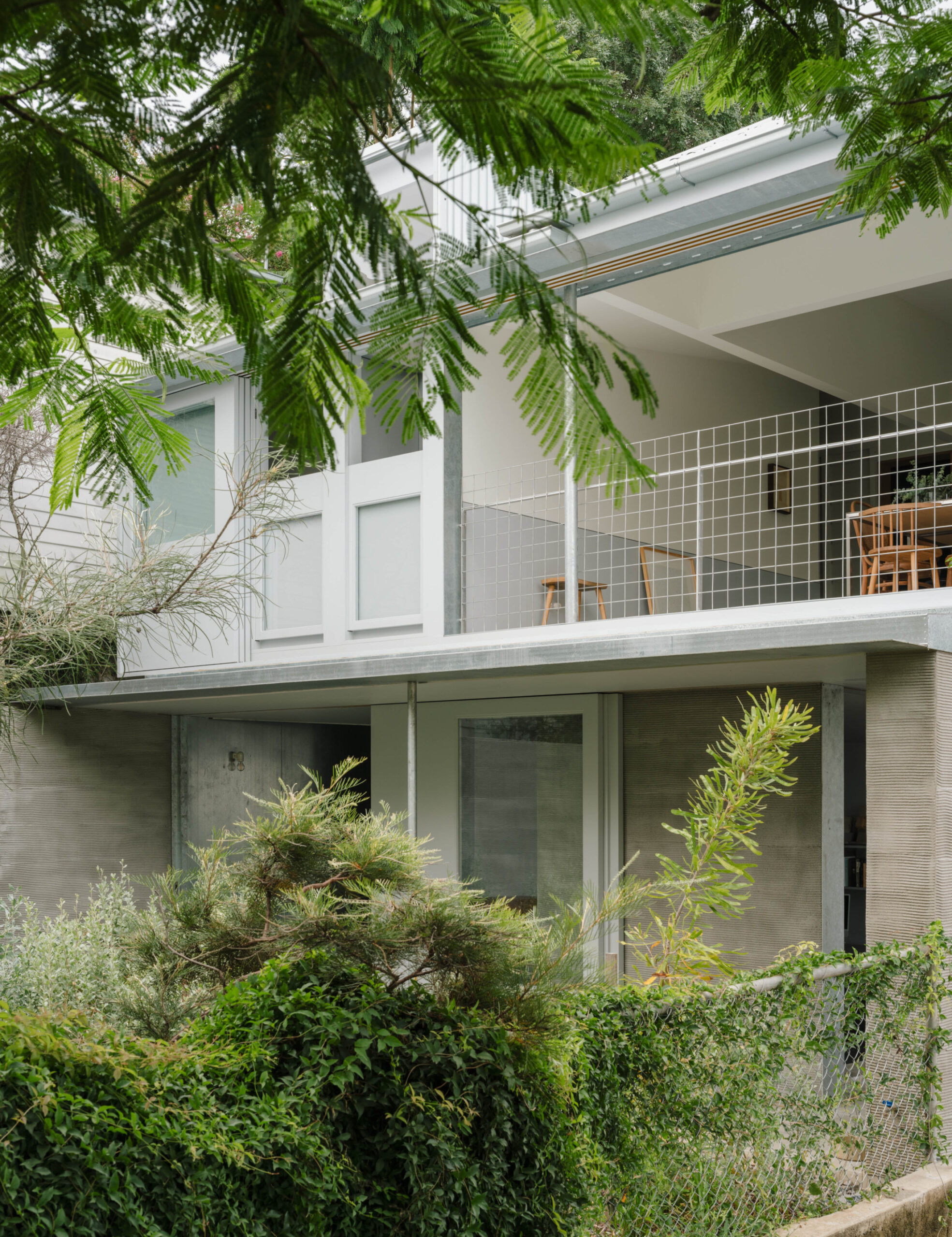
The rooms at the front of the house — namely the bedrooms, living room and kitchen — evoke a sense of warmth with highly crafted textural details and timber panelling. By contrast, the rear of the project is more pared back and austere in its material quality to direct focus outwards to the greenery of the backyard garden.
‘The garden is another significant aspect to the project,’ says Nicholas. ‘In 2011, the backyard consisted mostly of turf. But over the years, we have redesigned and planted it to consist of a mostly native garden with minimal turf.
‘Reducing the amount of turf prioritises diversity of flora and fauna and brings planting right up to the edge of the building to be enjoyed from within the interior.’
As he and Zuzana envisioned, the downstairs area is now home to their very own architecture studio — but it was actually only completed last year. Keeping with the brutalist design of the upper dining room and bathroom, the work space features raw and hard-wearing materials such as off-form concrete, raked cement and galvanised steel. It also opens through large sliding doors to the edge of the garden and a separate entrance off the side street.
‘The renovations have completely reordered the way the house functions and brought character, light and views to each of the rooms we use everyday,’ Nicholas adds. ‘The new connections made between the house and the exterior have made the backyard feel like an adjunct living room.’

