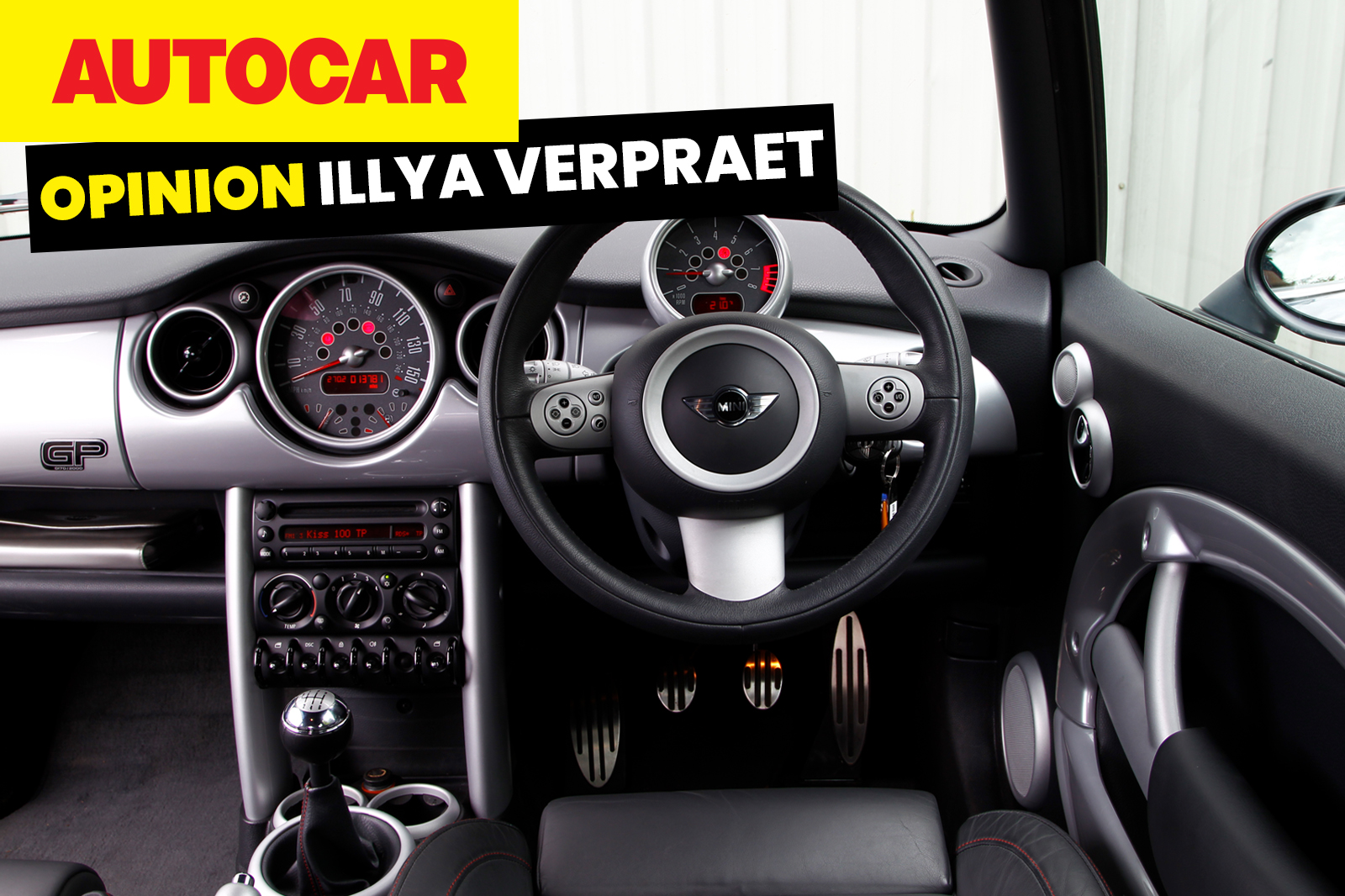
I’m increasingly fed up with digital gauge clusters. The promise of configurability, of showing you the things you want, almost never materialises. Instead we get zany takes on the speedo that are always the wrong brightness.
A nice set of analogue gauges, on the other hand, is often much clearer and projects a sense of craftsmanship, of design. I have very little interest in Bugatti’s latest zillionaire’s toy, the Tourbillon, but I love what they have done with the analogue watch-inspired gauge cluster.
Morgan’s Plus Four and Plus Six have a digital driver display, but it’s small and easily ignored. Meanwhile, the big round instruments in the middle are such a feature. It’s one of the reasons why I find those cars so oddly relaxing to drive long distances.
I wish they would fully lean into the old-timey vibe and just ditch the screen altogether.
I’m racking my brain for more affordable examples of nearly screen-free modern cars, but other than the Caterham Seven and other ultra-niche stuff, I’m drawing a blank. Even the Kia Picanto has a twin-screen set-up.
I’m not into watches, but I like that the ones that people seem to care about tend to be the more ornate, classic, analogue options, so there’s clearly an appetite for that sort of thing in the mechanical devices we use every day.
Screens are useful, so they are here to stay, but it’s time for car interior designers to stop hiding behind black rectangles.

